App Analysis:
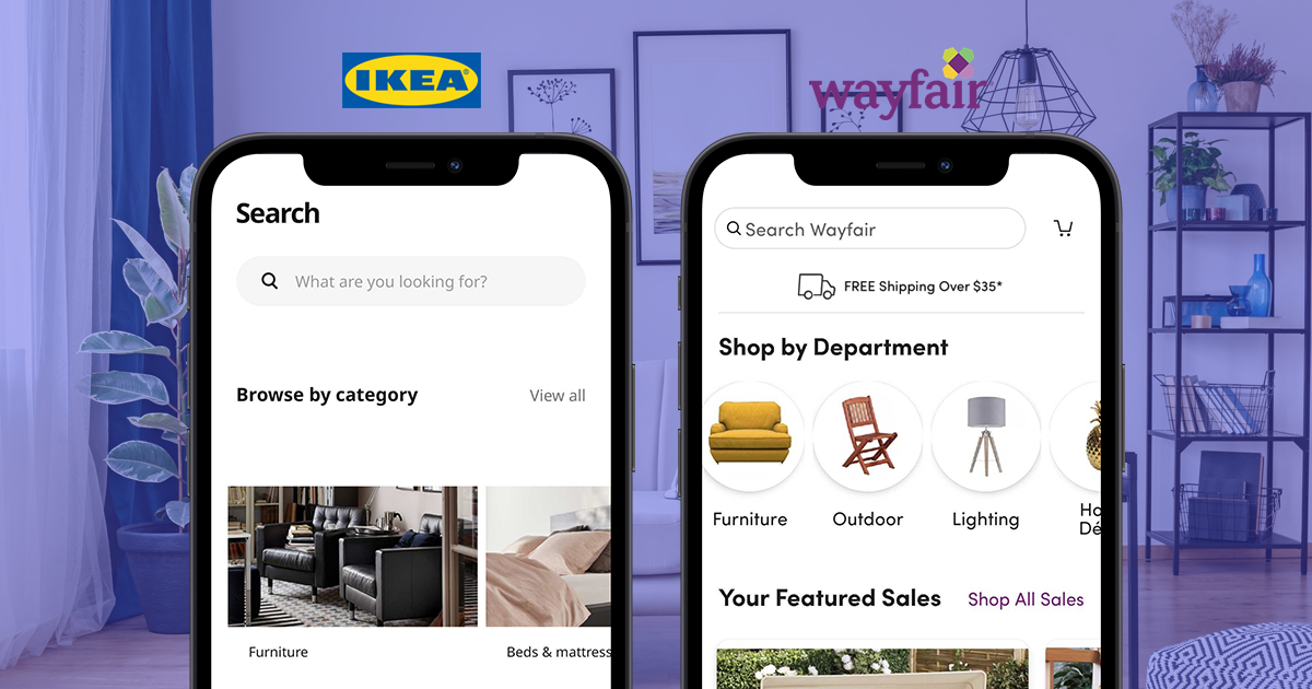
IKEA vs. Wayfair
The Swedish giant and the e-commerce titan have something in common: They want you to furnish and decorate your home with their products.
While they share an end goal, both their apps and approaches are quite different. Let's see who does it better.

You can expect:
- A thorough UX audit of the IKEA and Wayfair apps
- 60+ screenshots that illustrate every aspect of the analysis
- Insights that you can apply to your own app
Here's the deal:
Good UX isn't determined by a set list of factors, but there are some you should keep in mind when building an app. Different apps will call for different UX needs, but reviewing what others are doing is a smart way of knowing what works — and what doesn't.
These are some of the key areas that are particularly important for a furniture and décor app:
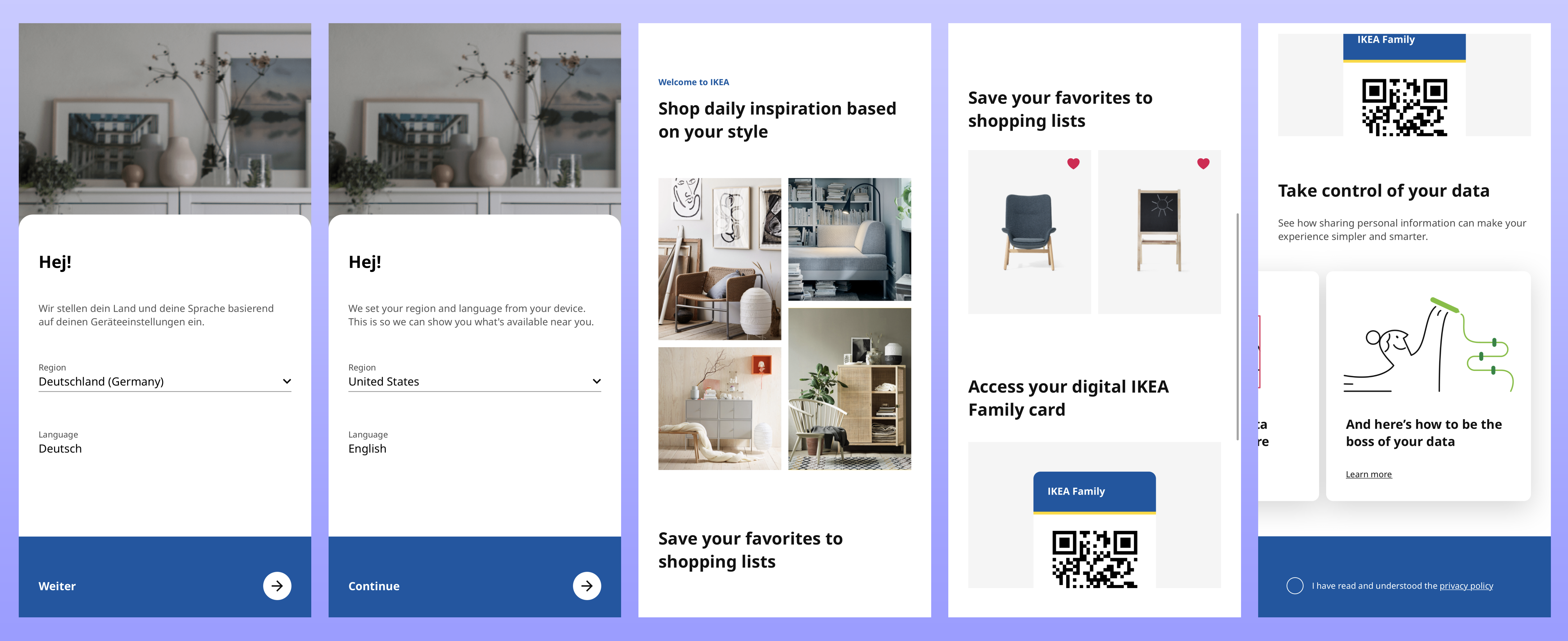
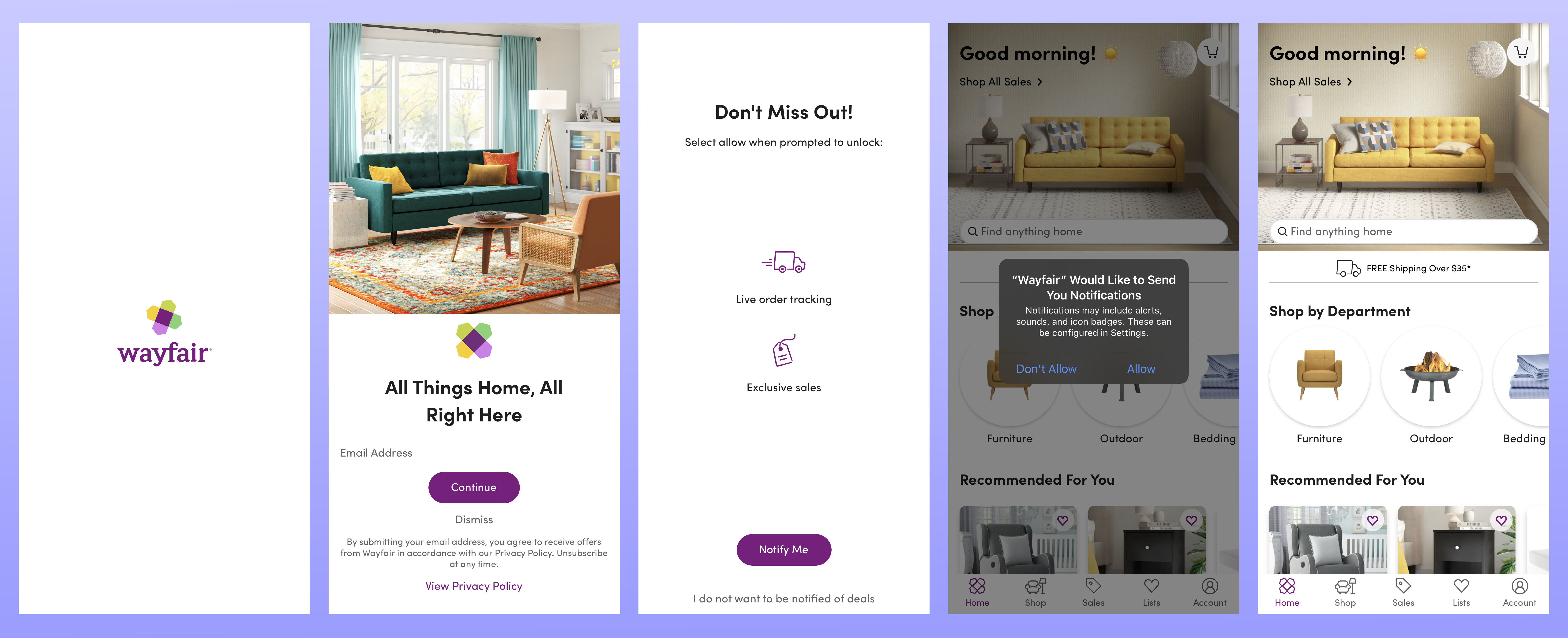
- Onboarding
- Usability
- Designing and decorating a room
- Checkout process
- Engagement


An analytics solution trusted by global brands

CUSTOMER STORIES

We now use UXCam to validate our product ideas and test out hypotheses with raw, actionable user insights.
Housing.com
Gaurav Jain Lead Product Manager
Read the case studyCUSTOMER STORIES
If something goes wrong within the app, UXCam is the first port of call to understand what’s going on. Playing a key role across multiple teams, UXCam is now an integral part of the launch and live ops strategy.
Costa Coffee
Daniel Tomlinson Global Digital Analytics Manager
Read the case studyCUSTOMER STORIES

We wanted to make data-driven decisions on what content to push out next and evaluate how our instructors are doing. With UXCam, we get a holistic picture of the top performing content within the app and the instructors that drive the highest user engagement.
Inspire Fitness
Neil Jain Product Manager
Read the case study